
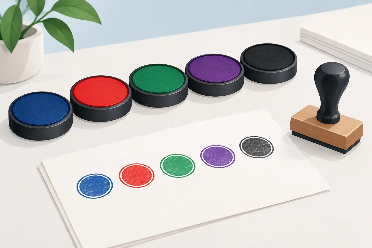
A stamp can carry the right wording and still fail to do its job if the impression is hard to read. The best stamp ink colours make routine marking clearer at a glance, whether you are approving invoices, marking pupils’ work, updating a service book or stamping loyalty cards. Colour is not simply a design choice. It affects visibility, meaning and how confidently people can act on the information in front of them.
For most day-to-day paperwork, black or blue remains the sensible starting point. But there are good reasons to choose red, green, purple or a more distinctive colour when the stamp has a particular purpose. The key is to match the ink to the job, the surface and the people who will rely on the impression.
Start with the purpose of the stamp
Before choosing a colour, consider what the stamp needs to communicate. A date stamp on incoming post has a different role from a teacher feedback stamp or a garage service stamp. If every mark looks alike, important information can be missed in a busy file, workbook or workshop record.
Black ink is the dependable all-round option. It gives strong contrast on white paper, scans well and suits formal office documents. It is a practical choice for address stamps, company details, signatures, reference numbers and general administration. Where documents may be copied, filed or sent to another organisation, black provides a clean and familiar result.
Blue ink is also widely used in offices and professional settings. It stands out clearly against black printed text, which can help show that a document has been checked, received or signed after printing. Many businesses choose blue for approval stamps, office processing marks and internal paperwork for this reason.
Red is useful when a stamp needs attention. It can work well for messages such as PAID, OVERDUE, URGENT, CANCELLED or ACTION REQUIRED. Used sparingly, red provides a clear visual prompt. Used for every stamp on every sheet, however, it can make paperwork look more alarming than necessary and reduce its impact.
Green often carries a more positive meaning. In schools, it is a popular choice for praise, achievement and feedback stamps. In an office, it can suit APPROVED or COMPLETED impressions. Purple offers another distinctive option where several departments, staff members or stages of a process need to be identified quickly.
Stamp ink colours for common working settings
The right choice depends on the environment. A colour that works well at a wedding table may not be appropriate for a legal file, while a bright classroom stamp may be exactly what makes feedback more noticeable to a pupil.
Offices, accounts and administration
Administrative stamps need to be legible, repeatable and suitable for filing. Black is normally best for company address stamps, document references and routine record keeping. Blue can separate processed paperwork from printed information, particularly on forms and invoices.
For finance teams, red is often reserved for exceptions and action points, such as unpaid balances or credit notes. This is useful only if the meaning is consistent across the team. Agreeing that red means one thing prevents confusion when documents pass between colleagues.
Schools and education
Teachers often use colour to make marking faster and feedback easier to spot. Green is commonly associated with positive comments, while purple, red or blue can distinguish next steps, corrections or individual teacher feedback. There is no single rule, but pupils benefit when the system stays consistent.
A praise stamp in a bright colour can feel more immediate than a handwritten note, especially for younger children. For departmental marking, different ink colours can also help show which stage has been completed without adding lengthy notes to every piece of work.
Bear in mind that not every pupil sees colour in the same way. A stamp should still use clear words or symbols rather than relying on red and green alone to convey its message. Good contrast and simple wording matter more than a colour code by itself.
Garages, workshops and service records
Service stamps need to remain clear in logbooks and on paperwork that may be kept for years. Black or blue is usually the safest choice, particularly where a stamp includes a garage name, service date, mileage field or contact details. A crisp impression looks professional and is easy for customers to read later.
If a workshop uses separate stamps for inspection, service completion and follow-up work, different colours can make the process easier to track. Keep the number of colours limited, though. A simple system is more useful than one that staff have to stop and interpret.
Retail, loyalty schemes and events
For loyalty cards, darker colours usually give the best contrast and are less likely to resemble a faint smudge after repeated handling. Black, blue and purple are reliable choices on most plain card stock. If the card has a coloured background, test the ink against it first.
At events, coloured hand stamps can assist with entry control, re-entry and age-verified areas. The colour needs to be visible in the venue lighting and distinct enough from previous days or sessions. For this type of use, durability matters just as much as appearance, particularly where skin contact, movement and handwashing are involved.
Match the ink to the surface
Paper is forgiving, but not all materials accept ink in the same way. Standard office ink is designed primarily for absorbent paper and card. It may smudge, bead up or rub away on glossy labels, coated stock, plastic, metal or fabric.
For ordinary documents, a self-inking stamp with a built-in pad offers a quick, tidy solution. The ink is held inside the stamp body, helping to deliver consistent impressions over repeated use. A traditional hand stamp and separate ink pad can be better where you need to switch colours regularly or use a specialist ink for a particular material.
Egg stamping, for example, calls for food-safe ink that is suitable for the intended application. Event hand stamps may require skin-safe formulations. These are specific jobs, so it is worth choosing a product intended for that surface rather than trying to make general-purpose office ink do something it was not made to do.
The colour of the surface matters too. Dark ink on pale paper is usually easiest to read. On kraft card, coloured paper or recycled stock, black may still work well, but blue or purple can occasionally lose contrast. A test impression on the actual material is the quickest way to avoid ordering a colour that looks good in theory but disappears in practice.
Think about copies, scans and long-term records
A vivid colour can look excellent on the original document but become less clear when copied or scanned in greyscale. If paperwork may be sent digitally, printed by another department or retained as evidence, choose an ink that remains legible without colour.
This does not mean every operational stamp must be black. It means the wording, size and contrast need to do their share of the work. A clear PAID stamp in red can still be understood in a black-and-white scan if the lettering is bold and well spaced.
Avoid pale inks for information that must be retained. Light pink, yellow or pastel shades can be attractive for personal projects and occasion stationery, but they are not always suitable for forms, records or high-volume workflows. For wedding favours, christening details or personalised gift packaging, the visual effect may matter more. For business records, readability normally comes first.
Keep your colour system simple
Where more than one person uses stamps, write down what each colour means. A short instruction beside the stationery cupboard can prevent red being used for both paid invoices and urgent problems, or green being used for both completed work and items awaiting review.
It also helps to store replacement pads and refill ink with the relevant stamp. Using the wrong refill can affect the quality of the impression and, in some cases, the operation of the stamp. Re-ink before impressions become faint rather than pressing harder, as excessive pressure can create blurred edges and uneven marks.
For custom stamps, the clearest choice is usually the one that lets people understand the message immediately. Handy Stamps can help businesses, schools and organisers choose practical stamp formats and ink options for regular use.
A well-chosen colour saves a second look. Make the mark clear, keep its meaning consistent, and test it on the material you use every day before placing a larger order.