Posted on

Embosser Versus Stamp: Which Is Right for You?

Embosser Versus Stamp: Which Is Right for You?

A raised seal can make a certificate feel official. A clear ink impression can process fifty invoices before lunch. The embosser versus stamp choice comes down to what you are marking, how often you need to do it and whether the mark needs colour, permanence or visual impact.

For most everyday office, school, retail and trade tasks, a stamp is the quicker and more flexible option. An embosser has a more specialised role, but it can be exactly right for formal paperwork, membership documents and premium printed materials.

Embosser versus stamp: the core difference

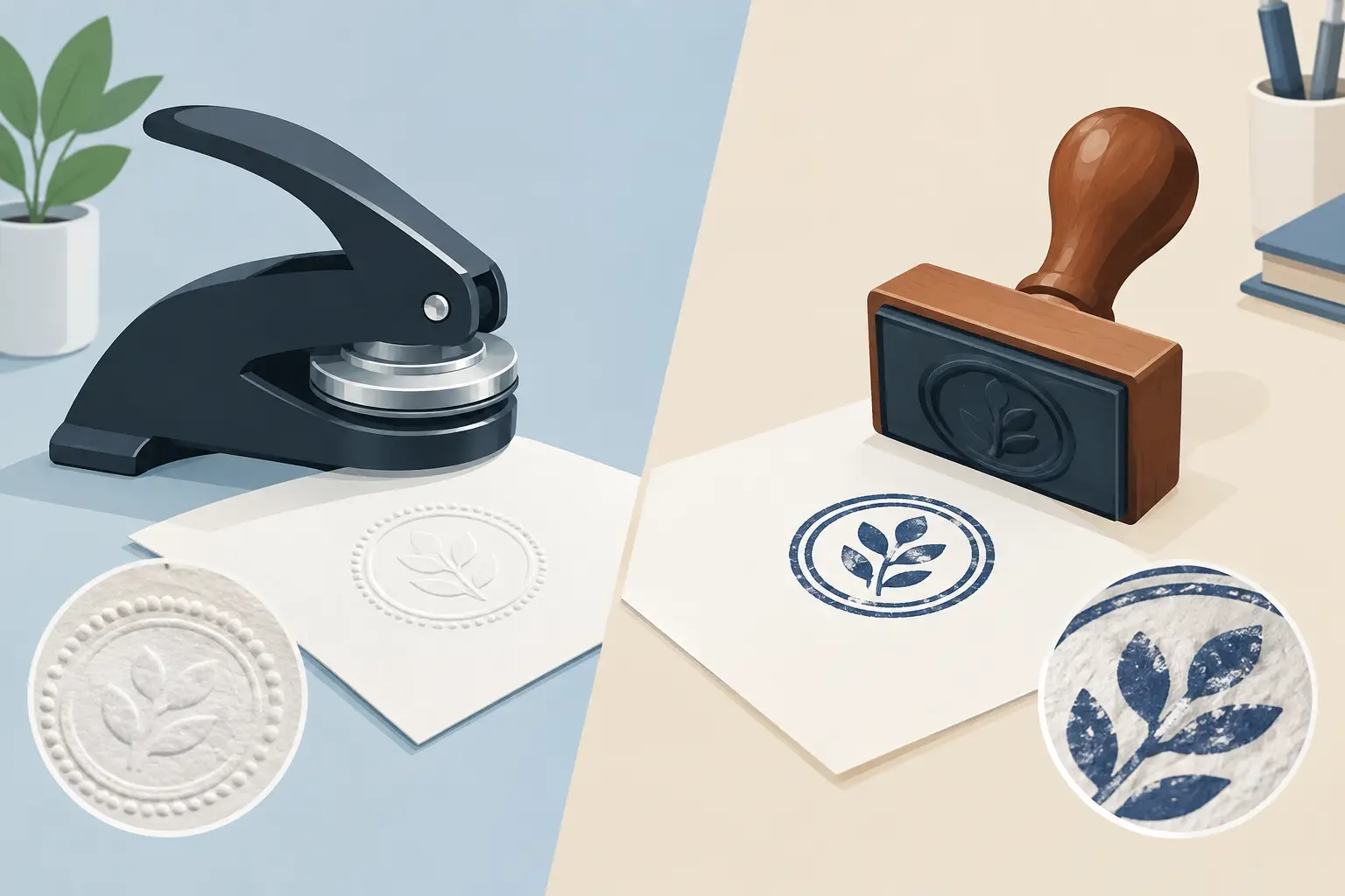
An embosser uses pressure rather than ink. It presses a design into paper or thin card, leaving a raised impression on one side and an indented impression on the other. The result is tactile, clean and permanent because there is no ink to fade, smudge or run.

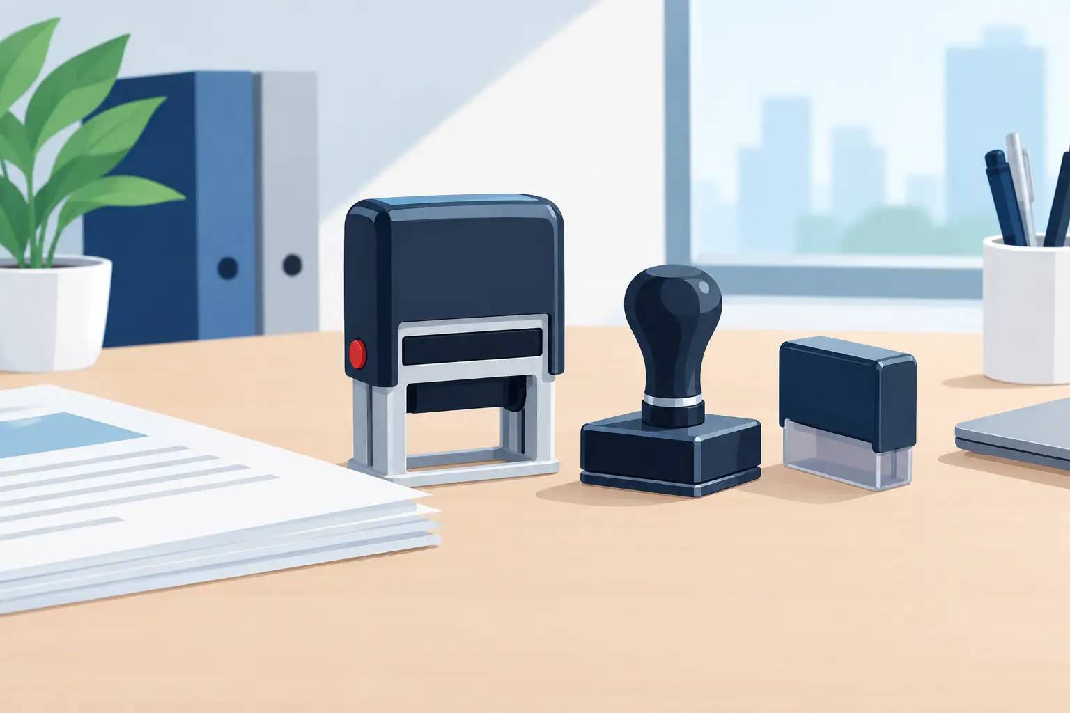
A stamp transfers ink from a rubber die to the surface being marked. Self-inking stamps keep the ink pad inside the unit, making them particularly useful for repeated work. Traditional hand stamps use a separate ink pad and can offer greater flexibility with ink colours and specialist inks.

That basic difference affects everything from the materials you can mark to the speed of the job. A stamp is designed for visible information: a date, address, approval message, teacher feedback, logo or loyalty mark. An embosser is designed for a formal, texture-based impression.

When an embosser is the better choice

Embossers work best on good-quality paper and lightweight card. They are commonly used for certificates, official correspondence, book ownership marks, legal or professional stationery, club documents and invitations. A raised seal gives a document a distinctive finish without adding another colour to the page.

This is particularly useful where an inked mark might look too bold or distract from carefully printed artwork. A wedding invitation, for example, may suit a discreet embossed monogram better than an ink stamp. The same applies to premium letterheads, presentation certificates and documents intended to be kept.

An embosser is also useful where you want a mark that cannot be accidentally smeared. Once the impression has been pressed, there is no drying time and no ink supply to manage. It is a tidy option for occasional use at a desk.

There are limits. Embossing is not suitable for every material, and heavy card may be difficult to press cleanly. It can also be harder to see in poor light, especially on white paper. If people need to read the wording quickly, an ink stamp is normally the more practical choice.

A note on formal use

An embossed seal can add authority to a document, but it does not automatically make that document legally binding. If you are using one for company, legal or professional paperwork, make sure the wording and process meet the requirements of your organisation or profession. The embosser provides a physical mark, not legal status by itself.

When a stamp is the better choice

Stamps are built for routine marking. An office administrator can mark incoming post, paid invoices and copies quickly. A teacher can give consistent feedback across a set of books. A garage can add service details to a record booklet, while a café can mark loyalty cards at the till.

The major advantage is clarity. Ink creates an immediate, high-contrast impression that is easy to spot, scan and understand. You can include text, simple logos, dates, boxes for handwritten details or combinations such as “Received”, “Checked” and “Approved”.

A self-inking stamp is often the best all-round format for frequent use. The mechanism re-inks the die after each impression, helping produce a consistent result without reaching for a separate pad. It keeps hands and desks cleaner too. For lower-volume work, larger designs or unusual ink colours, a traditional hand stamp may make more sense.

Stamps are also more versatile across materials, although results depend on the ink. Standard office ink is intended for paper and card. Specialist inks may be needed for glossy surfaces, plastics or other non-porous materials. Always consider the surface before ordering, particularly if the mark needs to resist handling or moisture.

Compare the practical factors before ordering

The right choice is rarely about which product looks better in isolation. It is about how it fits into the work you need to do.

Speed and volume

If you need dozens or hundreds of impressions each week, choose a stamp. A self-inking model is quick to use, easy to keep at a workstation and designed for repeat tasks. An embosser requires more physical pressure and is better suited to smaller batches or individual documents.

For a school office stamping forms, a shop stamping loyalty cards or a business processing paperwork, ink will save time. For signing off a small number of certificates, embossing may be perfectly manageable.

Visibility and information

Use a stamp when the message must be read at a glance. Ink gives you contrast and supports more detailed wording. This is why date stamps, address stamps, inspection stamps and teacher stamps remain practical working tools.

Use an embosser when the impression itself is the point. A seal can carry a name, initials, logo or crest, but fine detail may not reproduce as clearly as it would in ink. Keep embossed artwork simple, with sensible spacing and strong lettering.

Appearance and brand presentation

An embosser has a formal, understated appearance. It suits documents where texture and presentation matter more than immediate visibility. It can feel considered and traditional without being decorative for its own sake.

A stamp can be formal too, but it is more direct. A crisp logo stamp on packaging, bags or cards can reinforce a small business brand at low cost. For events, a hand stamp offers an efficient way to identify paid entry or returning guests. The best option depends on whether you want a subtle seal or an obvious mark.

Running costs and upkeep

An embosser has no ink pad to replace. Its ongoing maintenance is minimal, although the mechanism should be stored safely and kept clean. The initial cost may be worthwhile if you use it for a long-running formal purpose.

A stamp needs ink, and eventually a replacement pad or a new unit depending on its type. That is not usually a major cost, especially for a self-inking stamp used regularly. It is simply part of keeping a high-volume marking process running properly.

Paper and material suitability

Embossers are mainly for paper and thin card. They are not a general-purpose option for boxes, plastic, fabric or uneven surfaces.

Stamps give you more options, but only with the correct ink and a suitable surface. Absorbent paper is the easiest material to mark. Coated stock can need a slower-drying ink, and curved or textured surfaces may not take a full impression. If the application is unusual, test the material before committing to a large order.

Choosing a design that works

Whether you choose an embosser or stamp, the design needs to suit the tool. Avoid trying to fit too much into a small marking area. Tiny text, narrow gaps and intricate artwork can reduce legibility.

For a working stamp, start with the action or information people need to see. “PAID”, “RECEIVED”, a company name, a telephone number or a clear date field will usually be more useful than a crowded layout. For an embosser, a simple name, monogram or clean logo tends to give the strongest impression.

Think about the people using it as well. A stamp handled by several members of staff should be easy to recognise and difficult to misuse. A date stamp should have a comfortable adjustment mechanism. An embosser used for certificates should have a layout that sits neatly in the intended position on the page.

A practical way to decide

Choose an embosser if you need a permanent, ink-free raised seal on good paper or card, and you are producing documents where presentation is central. It is well suited to certificates, formal stationery and special occasion pieces.

Choose a stamp if you need speed, readable information, colour or regular repeat use. It is the stronger choice for offices, classrooms, garages, shops, events and everyday administration. For many businesses, a self-inking stamp provides the best balance of clean impressions, quick handling and low ongoing effort.

There is no need to treat the two tools as rivals in every setting. A professional certificate may use an embosser for its seal and a stamp for its issue date or reference number. Pick the tool that makes the next task clearer, quicker and easier to repeat.

Posted on

Practical Guide to School Administration Stamps

Practical Guide to School Administration Stamps

The school office is often where small delays become bigger problems: an unsigned form, an unclear payment record, a visitor without the right identification or a letter waiting to be processed. A guide to school administration stamps should therefore start with the everyday jobs that need a quick, consistent mark. The right stamps reduce handwriting, make paperwork easier to scan and help staff follow the same process when the reception desk is busy.

What school administration stamps are used for

Administrative stamps are different from classroom marking stamps. Their purpose is to move documents, records and visitors through a school clearly. A simple dated impression can show when a form arrived. A payment stamp can give office staff and parents a clearer record. A visitor stamp can support a more orderly sign-in process when used alongside the school’s own safeguarding procedures.

Common uses include incoming post, applications, consent forms, pupil records, invoices, purchase orders, trip paperwork, payment cards, library notices and internal circulation. The best wording depends on the system already in place. A stamp should reinforce a process, not create a separate one that only one member of staff understands.

For many schools, the most useful starting point is a small set of general office messages: RECEIVED, PAID, COPY, CONFIDENTIAL, ACTION REQUIRED and a date stamp. These cover a surprising number of tasks without filling drawers with rarely used tools.

Choose stamps around the workflow, not the catalogue

Before ordering, follow a typical document from arrival to filing. Ask who handles it, what decision is made, whether a date or initials are needed, and where it is stored afterwards. This reveals whether a short wording stamp is enough or whether a larger impression with fields is more useful.

For example, a simple RECEIVED stamp is suitable for letters and forms where the arrival date is the key detail. A payment record usually needs more space, perhaps for date, amount, method and initials. For an invoice approval process, a stamp with boxes for authorised by, cost centre and date can make checking easier before finance records the transaction.

Avoid putting too much into one design. Tiny boxes and long instructions may look comprehensive on screen but become hard to read on a busy paper form. If staff must write several lines of information, a larger traditional hand stamp may offer more room. If the message is short and repeated all day, a compact self-inking stamp is normally the more efficient choice.

Standard wording or personalised wording?

Ready-made wording works well for familiar office actions such as PAID, RECEIVED or CONFIDENTIAL. It is quick to introduce and easy for relief staff to recognise. Personalised wording is better where the stamp needs to match a school-specific form, department name or approval route.

A personalised stamp can also include the school name, telephone number or return address, but only include details that genuinely help. A full address stamp is useful for outgoing correspondence and book labels. It is less useful on internal paperwork where the school identity is already obvious.

Stamp types for a busy school office

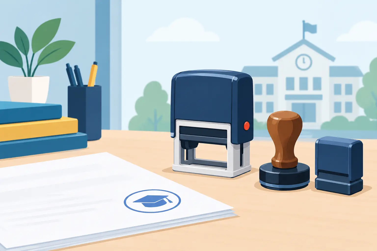
Self-inking stamps are often the practical choice for routine administration. The ink pad is built into the stamp, so the impression is quick, clean and consistent with no separate pad to manage. They suit reception desks, finance offices and departments that need the same wording repeatedly.

Traditional rubber stamps are a good option for larger designs, occasional use or specialist forms. They need a separate ink pad, which adds one small step, but they offer flexibility in ink colour and can be an economical choice for larger-format impressions. Keep the ink pad stored flat and closed when not in use to help prevent it drying out.

Date stamps deserve particular attention. A manually adjustable date stamp is useful wherever arrival, issue or approval dates matter. Choose one with a date format that is immediately clear to staff and families, such as 25 SEP 2026, rather than a numerical format that could be misread. Set a routine for changing the date at the start of each working day, particularly if several people use the same reception desk.

For departments that deal with confidential paperwork, a clearly marked CONFIDENTIAL stamp can be helpful. It should not be treated as a safeguarding control in itself, however. Sensitive records still need appropriate access, storage, retention and disposal procedures.

A practical guide to school administration stamp wording

Clear wording prevents hesitation. Staff should be able to understand the purpose of the mark at a glance, including someone covering reception during illness or a busy parents’ evening. Use plain terms and avoid abbreviations unless they are already established across the school.

Useful examples include:

  • RECEIVED with a date line for letters, forms and documents handed in at reception.
  • PAID, PART PAID or PAYMENT RECEIVED for clubs, meals, trips or other approved payment records.
  • RETURN TO OFFICE for paperwork that has been sent to a classroom or department in error.
  • ACTION REQUIRED for documents that need a named colleague to deal with them.
  • COPY FOR FILE to show that a document should be retained with the relevant record.
  • VISITOR, CONTRACTOR or DELIVERIES for local sign-in or pass processes where appropriate.

For payment stamps, be precise about what the mark proves. PAID can suggest that a full payment has been received, while PAYMENT RECEIVED is safer where a balance may remain. Similarly, an APPROVED stamp should only be used where the school has agreed who is authorised to approve the relevant item. The wording needs to reflect responsibility, not merely speed up the paperwork.

Size, ink colour and legibility

A stamp that is too large can obscure key information on a form. One that is too small can disappear among handwriting and printed boxes. Measure the available space on the documents used most often before choosing a size. It is worth printing a rough outline on paper to check that the impression will sit comfortably in the intended area.

Black or blue ink is usually the clearest choice for general office documents. Red can be useful for urgent actions or outstanding items, but should be reserved for a meaning that staff recognise consistently. Multiple colours may look organised at first, yet they can complicate reordering and confuse the process if they are not documented.

Legibility matters more than decoration. Choose a straightforward typeface, adequate spacing and enough contrast for photocopies and scans. If paperwork is likely to be copied in black and white, do not rely on colour alone to communicate status.

Introduce stamps without weakening record keeping

A stamp should make the process more reliable, not make it easier to skip steps. Decide where each stamp lives, who may use it and what staff need to add by hand. For some documents, an initial and date beside the impression gives a more useful audit trail than the stamp alone.

Keep a short reference sheet in the office or shared procedure folder. It can explain what each administrative stamp means, when it should be used and whether the document also needs to be entered on the school’s digital system. This is especially helpful when new administrators join or responsibilities move between staff.

Review the selection once a term or after a change to office procedures. If a stamp is barely used, it may not be needed. If staff are repeatedly writing the same phrase, that is a strong sign that a new stamp could save time and improve consistency.

Ordering for more than one department

Schools often benefit from buying a small standard range for reception, finance, attendance, pastoral teams and the headteacher’s office, then adding personalised stamps only where the process differs. Standardising common wording reduces training time and makes it easier to replace a stamp when it reaches the end of its working life.

For larger orders, confirm the wording and layout with the people who will use the stamp before it is made. A quick check of a proof against the actual form can prevent an avoidable mistake. It is also sensible to keep an agreed record of each design so that a replacement matches the original.

Handy Stamps can produce both practical stock wording and personalised designs, allowing schools to build a set that suits their own forms and routines. For urgent operational needs, checking dispatch times and approving the wording carefully can keep the order straightforward.

The most useful school administration stamps are rarely the most elaborate. They are the ones that make a repeated task clearer every time: a clean date on a received form, a visible payment record or a simple instruction that sends paperwork to the right person without delay.

Posted on

Egg Stamps for Clear, Safe Shell Marking

Egg Stamps for Clear, Safe Shell Marking

A handwritten date on an egg box can be missed, smudged or separated from the eggs themselves. Egg stamps put a clear mark directly on the shell, helping producers and small food businesses identify stock quickly while presenting eggs neatly for sale or service. The right stamp and ink make this a fast, repeatable task rather than another job at the packing bench.

Why clear egg marking helps

For a smallholding, farm shop, market stall or catering business, eggs are often handled in small batches. That makes simple identification useful. A shell stamp can show a farm name, flock reference, use-by prompt, batch detail or a short message such as “Free Range”. It gives customers an immediate visual cue and makes products easier to recognise once they are out of their tray.

A consistent mark can also support day-to-day stock control. If you collect from more than one flock, sell through several outlets or supply local cafés, a short batch code or collection date can help staff separate stock without relying on memory. The wording needs to be brief enough to read at a glance, particularly on smaller eggs where the printable area is limited.

There is a presentation benefit too. A crisp, well-positioned impression looks deliberate and professional. This matters for direct sales, gift boxes and local food businesses where customers can see the product before they buy it.

Choosing egg stamps for the job

Eggshells are curved, smooth and occasionally dusty, so a standard office stamp is not always the best choice. A purpose-made egg stamp should be comfortable to hold, give even pressure and work with an ink approved for this type of food-contact application. The aim is a readable image in one controlled press, without cracking the shell or leaving a heavy, blurred mark.

Start with the ink

Ink is the first decision, not an afterthought. Use only food-safe ink specifically intended for marking eggshells, and follow the manufacturer’s instructions for storage, application and cleaning. Ordinary stamp-pad ink, permanent marker ink and general-purpose craft inks are not suitable substitutes.

Colour affects legibility. Dark ink usually stands out best on pale shells, while a lighter or contrasting colour may suit brown eggs. Test your chosen ink on a representative sample before marking a full batch. Shell colour varies naturally, and an impression that looks sharp on one egg may be harder to read on another.

Ink should be applied lightly and evenly to the stamp face. Too much ink is one of the main causes of spread and smudging. If impressions begin to lose definition, clean the stamp gently, allow it to dry as instructed and re-ink with a small amount.

Keep the design simple

An egg gives you less flat space than a label or carton. Fine detail, long web addresses and very small lettering may look good on a screen but become unclear on a curved shell. A bold farm name, a simple symbol or a short line of text is generally more effective.

Choose lettering that remains clear at a small size. Avoid squeezing too much information into one design. Where traceability requires several details, it may be better to stamp a concise identifier on the egg and keep fuller information on the box, tray or accompanying paperwork.

Round designs often sit naturally on the shell, but the best shape depends on the wording and logo. A compact rectangular layout can work well for a date or batch code. If branding is the priority, a simple logo with strong lines is usually more reliable than an intricate illustration.

Match stamp size to your eggs

The mark should be large enough to read without dominating the shell. Smaller stamps suit quail eggs, pullet eggs and mixed boxes, while a modestly larger design can work on standard hen eggs. Ordering a stamp that is too large can lead to uneven contact around the curve, especially if the design includes text near the edge.

If you pack several egg sizes, test the chosen size on each one. This small check can prevent a design that performs well on large eggs from becoming distorted on smaller stock.

A practical process for clean impressions

Good results come from a steady process rather than extra pressure. Set up a clean, dry area with enough space for eggs before and after marking. Handle eggs carefully and make sure the shell surface is free from loose debris.

For repeat work, this simple routine helps keep impressions consistent:

  • Place the egg securely in a tray, carton or purpose-made holder so it cannot roll as you stamp.
  • Ink the stamp sparingly and make a test impression before starting a new batch.
  • Bring the stamp straight down onto the shell with light, even pressure. Do not twist the stamp.
  • Lift it directly away, then allow the mark to dry before moving or packing the egg.

The amount of pressure matters. Pressing harder will not usually improve the result. It can cause the ink to spread, mark more of the shell than intended or increase the risk of damage. A light, controlled touch is more dependable.

For larger batches, pause periodically to check the print quality. The first few eggs may look perfect, but ink can build up in small areas of the design over time. A quick clean at the right point is easier than reworking an entire tray.

Food safety, traceability and hygiene

Egg stamping should fit into your existing food-handling routine. Keep the stamp, ink and work surface clean, and store them away from unsuitable inks, chemicals and non-food packaging materials. Wash hands as required by your normal hygiene procedures, and do not use a stamp across unrelated tasks.

The mark on the shell does not replace the legal information that may be required for your particular route to market. Requirements can differ depending on whether eggs are sold directly from the holding, through a farm shop or market, via a retailer, or through a registered packing centre. Producer codes, grading, class markings, best-before information and packaging requirements are regulated areas.

Check the current guidance that applies to your business and speak to your local authority, packing centre or relevant regulator if you are unsure. This is particularly important if you are supplying other businesses or selling beyond direct local sales. A custom stamp is a useful operational tool, but it should support your compliance process rather than stand in for it.

It is also sensible to keep a simple record of the wording or code used on each batch. If a customer asks about origin or collection dates, clear records alongside clear shell marks make the answer easier to provide.

Where shell stamps are most useful

Egg stamps are particularly practical for independent egg producers selling direct to customers, farm shops packing local produce, market traders, cafés using their own or locally sourced eggs, and small food businesses putting together seasonal hampers. They can also suit schools, community farms and visitor attractions that sell eggs from their own hens.

The best use case is one where the same information needs to be applied repeatedly and clearly. A stamp saves time compared with handwriting, creates a more uniform result and helps staff follow the same process. For occasional, one-off labelling, a marked carton may be enough. For regular packing and direct sales, a dedicated shell stamp is usually the more efficient option.

Ordering a custom design with confidence

Before ordering, decide exactly what must appear on the shell. Keep the wording short, check spellings and consider how it will read at a small size. If you are including a logo, use a clean version with clear lines rather than a detailed image designed for a large sign or website header.

It helps to think about who will use the stamp. A producer marking a dozen eggs at a time has different needs from a farm shop team preparing several trays before opening. In both cases, a well-made stamp, suitable food-safe ink and a simple design keep the task quick and consistent.

A clear egg mark is a small detail, but customers notice small details. When it is clean, readable and used as part of a sensible packing process, it gives every egg a more professional finish before it reaches the shelf, counter or breakfast table.

Posted on

Date Stamps Versus Numbering Stamps Compared

Date Stamps Versus Numbering Stamps Compared

A delivery note arrives, a vehicle is booked in, a pupil’s work is marked or a document is received at the office. The choice between date stamps versus numbering stamps affects what that impression tells you later. One records when something happened. The other gives it a unique place in a sequence. Both save time, but they solve different administrative problems.

Choosing the right one is less about the stamp itself and more about the record you need to create. If a colleague needs to know when paperwork was processed, a date is the useful detail. If you need to trace ticket 00482, invoice 00483 and job card 00484 in order, numbering is what keeps the process controlled.

Date stamps versus numbering stamps: the key difference

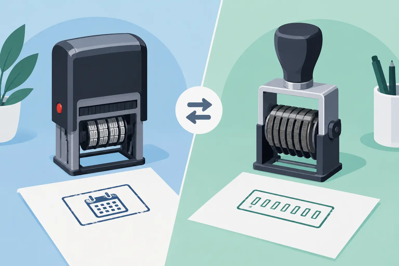
A date stamp prints a changeable date, usually with separate bands for the day, month and year. It gives every document, item or record a clear time reference. This makes it particularly useful where receipt, approval, inspection or completion dates matter.

A numbering stamp prints a sequence of digits. Depending on the model, the user can set the number manually or use an automatic mechanism that advances after each impression. It is designed to identify items in a running order, rather than show when they were handled.

The distinction sounds simple, but it can prevent muddled records. A date on its own cannot tell you whether two similar forms are part of the same batch or which was processed first that day. A number on its own cannot show whether a job card was raised this week, last month or last year. The best choice depends on which gap in your workflow needs filling.

When a date stamp is the practical choice

Date stamps suit any task where timing needs to be visible at a glance. In a busy office, a received date stamp can show when post, applications, contracts or invoices entered the system. Staff do not need to write the date repeatedly, and the impression stays consistent even when several people handle the paperwork.

For schools, a date stamp can support classroom routines and administration. Teachers may use one to show when work was handed in or assessed, while office teams can date incoming forms and correspondence. The aim is not just tidiness. A clear date helps staff answer straightforward questions quickly, such as whether a permission slip was returned before a deadline.

Garages and workshops also benefit where service records need a visible point of reference. Dating an inspection sheet, warranty paperwork or a vehicle check record helps establish when work was carried out. This is especially useful when customers return with questions about recent work or when a team needs to review the order of jobs.

Retailers and stockroom teams may use date stamps for goods received, returns, quality checks and short-life stock. A handwritten date can be missed or misread, particularly when the pace is high. A clean stamped impression makes the information easier to spot.

What to check before choosing a date stamp

Start with the date format your business already uses. In the UK, day-month-year is generally the clearest option for internal paperwork, avoiding confusion with American-style month-first formats. Check the available year range too. A stamp that remains usable for several years offers better value than one that soon needs replacing.

Consider the space available on the document. A compact date stamp is useful for invoices, forms and labels with limited room, while a larger impression may be easier to read on job sheets, parcels or warehouse paperwork. If the date must stand out, coloured ink can help, although black or blue often suits formal records best.

It is also worth deciding whether the date needs extra wording. A simple date is ideal for general use, but labels such as RECEIVED, PAID, CHECKED or POSTED make the purpose immediately clear. For repeat office tasks, a personalised stamp with fixed wording and an adjustable date can remove another small but frequent step.

When numbering stamps work better

Numbering stamps are built for control and traceability. They are a sound choice when each form, ticket, voucher or job needs its own reference number. The number creates a trail that can be matched with a ledger, spreadsheet, digital record or duplicate copy.

A garage might number vehicle inspection sheets or repair job cards. If a customer calls about a particular repair, the reference number gives the team a quick way to locate the associated paperwork. For event organisers, numbering tickets, wristband records or raffle entries helps account for what has been issued. Small businesses may use numbered receipts, order slips or quality-control forms to keep processes orderly without relying entirely on handwritten references.

In professional services, numbering can support file management where documents move between team members. A sequence makes it easier to spot a missing page, identify the next form in a batch or reconcile paper copies with a register. The benefit is simple: every item has a clear identifier.

Manual or automatic numbering?

This is the main decision within the numbering stamp category. A manual numbering stamp lets you set the digits yourself. It works well where numbers change occasionally, such as a file reference, batch code or recurring form number. It gives flexibility, but someone must remember to adjust it correctly.

An automatic numbering stamp advances the number after an impression, or after a chosen number of impressions depending on the mechanism. This is usually the better option for high-volume, consecutive work such as ticketing, receipt books and serialised forms. It reduces the chance of duplicate numbers and keeps staff moving when there is a queue of paperwork.

Automatic models do need sensible handling. Check whether the stamp advances before or after printing, how many repeat impressions it can make on the same number, and whether leading zeroes are required. A five-digit sequence such as 00001, 00002 and 00003 often looks neater and is easier to sort than numbers with changing lengths.

Do you need both stamps?

Many workplaces do. A date stamp records the event, while a numbering stamp identifies the item. Together, they create a much stronger paper trail without making the process complicated.

Take a workshop job card. The date can show when the vehicle arrived or when work was completed. The job number connects that card to the customer record, parts used and invoice. In an office, incoming correspondence can be dated on arrival and given a reference number if it needs to be logged, assigned or followed up.

Using both is particularly helpful where documents may be copied, separated from their original file or reviewed weeks later. A date provides context; a number provides a route back to the detail. However, do not add both simply because they are available. If staff only need to prove when an invoice was received, a date stamp is quicker and less cluttered. If they are issuing sequential collection tickets, the number is the essential part.

For processes that repeatedly require both details in the same place, a bespoke stamp layout may be worth considering. This can include fixed wording, a space for a reference number or an adjustable date, depending on the information your team handles most often. The right layout should make the routine easier, not turn a straightforward mark into another decision for staff.

Choosing a stamp for daily use

The body style matters as much as the information on the impression. A self-inking stamp is often the most convenient option for desks, reception points and classrooms because the ink pad is built in. It produces quick, repeatable impressions and is generally cleaner for frequent use. Replacement pads can keep a well-used stamp working without replacing the whole unit.

Traditional hand stamps can be a sensible choice for occasional use or larger impressions, but they need a separate ink pad. That gives more freedom to change ink colours or use specialist inks for different surfaces, though it adds a step to each use.

Think about the surface as well. Standard document ink is intended for paper and card. If you are marking non-porous materials, packaging, metal or other specialist surfaces, the ink and stamp material need to suit the job. A clear impression on the wrong surface is not useful if it smudges, fades or transfers.

Finally, consider who will use the stamp. A reception team needs something simple enough for several people to use consistently. A workshop may need a durable stamp that can cope with regular handling. For a low-volume personal project, flexibility may matter more than automatic operation. Handy Stamps can help customers choose a practical option based on the wording, frequency and type of material involved.

The most useful stamp is the one that removes a repeated task without creating another one. Choose a date stamp when timing is the record that matters, a numbering stamp when sequence and traceability matter most, and both when your paperwork needs to show the full story.

Posted on

How to Brand Kraft Paper Bags With Stamps

How to Brand Kraft Paper Bags With Stamps

A plain kraft carrier can look considered and recognisable without the cost, storage and minimum order quantities of printed packaging. For many independent retailers, makers, cafés and event organisers, the simplest way to brand kraft paper bags is with a well-made custom stamp. It gives you flexibility when stock, promotions or product ranges change, while keeping packing practical for busy staff.

A stamp is not the right answer for every bag requirement. If you post thousands of identical bags each month, professionally printed packaging may be better value. But where quantities vary, designs change or you need a smaller initial outlay, stamping bags in-house is a dependable option.

Why stamp brand kraft paper bags?

Kraft paper has a natural, uncoated surface that works well with a clear inked impression. The result can suit businesses that want packaging to feel simple, practical and less over-produced. A logo, business name, web address, social handle or short message can turn an ordinary bag into part of the customer experience.

The main benefit is control. You can stamp the number of bags needed for the day rather than ordering a large run in advance. This is useful for seasonal products, market stalls, wedding favours, pop-up shops and smaller retail operations. It also makes it easier to use one bag size across several product lines, changing the stamp rather than buying separate printed stock.

A custom stamp can do more than add a logo. Some businesses use a second stamp for product details, a loyalty message, collection dates or a simple “Thank you”. Keeping these elements separate gives greater flexibility than putting every detail into one large design.

Choose the right stamp size and layout

Start with the area of the bag that will be visible once it is filled and carried. A large artwork may look impressive on a flat bag but can become distorted or hidden by handles, folds and contents. In most cases, a centred design on the front panel is easiest to apply and easiest for customers to see.

For a small paper bag, a compact square or rectangular stamp is usually enough for a logo and name. Medium bags can carry a wider design with contact details underneath. Larger bags give more room, but that does not mean every space needs filling. A simple mark with enough clear space around it is often more legible than a crowded panel of text.

Keep small details to a minimum

Fine lines, very small lettering and intricate artwork are harder to reproduce consistently on textured paper. They may also fill with ink after repeated use. Use a high-contrast design with clear shapes and a sensible minimum text size. If your logo includes a detailed illustration, consider a simplified stamp version rather than forcing every element into the artwork.

Black ink is the most reliable choice for natural brown kraft paper, producing a neat, straightforward finish. Dark green, navy, burgundy and other strong colours can also work well. Pale inks may lose impact on brown stock, particularly under indoor lighting. Always test your chosen colour on the actual bag material before preparing a large batch.

Match the stamp to the workload

A traditional wooden hand stamp is a good fit for larger designs and occasional use. It is also practical if you need a particular ink colour, as you can choose the right ink pad for the job. For repeated daily stamping of a smaller design, a self-inking stamp is quicker and keeps the process tidier, although the available size and ink options may be more limited.

If you need to stamp a wide logo, a large hand stamp is generally more practical than trying to build a design from several smaller impressions. Multiple stamps can create an attractive handmade effect, but they take longer and require careful positioning.

Set up a repeatable stamping process

The difference between a smart branded bag and a patchy one is usually process, not expensive equipment. Set aside a clean, flat packing surface and make sure bags are completely flat before stamping. If the paper is creased or unsupported, the pressure will not transfer evenly.

Apply ink evenly rather than pressing the stamp hard into the pad. A few light taps normally give better coverage than one heavy push. Place the stamp on the bag, press firmly with even pressure, then lift it straight up. Avoid rocking the stamp from side to side, as this can blur text and edges.

Leave each bag to dry fully before stacking or filling it. Drying time depends on the ink, paper and room conditions, so test this before the first busy packing day. Fast-drying ink may be helpful for high-volume work, but some inks can look lighter or behave differently on absorbent kraft paper. The best choice depends on your design, the bag finish and how quickly bags need to be handled.

For regular use, make a simple positioning guide from card or board. Mark where the top and sides of the bag should sit, then use this as a repeatable reference. A guide helps different members of staff produce consistent placement without measuring every bag.

Practical checks before placing an order

Before committing to a stamp, review the artwork as it will appear at its final size. A design that reads clearly on a computer screen may not work at 50 mm wide. Check spelling, phone numbers, web addresses and any date-sensitive wording carefully. Correcting artwork before manufacture is much easier than replacing a finished stamp.

Think about how often your details change. If you regularly update prices, event dates or social accounts, keep those elements off the main logo stamp. Use a separate, smaller stamp for information likely to change. This protects the useful life of the main stamp and reduces unnecessary replacement costs.

It is also worth considering the bags themselves. Smooth kraft paper generally produces a sharper impression than heavily textured, recycled or ribbed stock. Twisted-handle carriers, flat gift bags and paper food bags can all be stamped, but their folds, handles and coatings vary. Requesting or buying a small bag sample first can prevent wasted stock.

When a stamped bag is the sensible choice

Stamped packaging works particularly well when you want branded presentation without losing flexibility. A florist can add a seasonal message to standard bags. A gift business can stamp a logo, then add a separate occasion mark for birthdays, weddings or Christmas. A farm shop or market trader can prepare batches as needed rather than storing printed bags for every product line.

It is also useful for internal packing and collection orders. A clear stamp can mark “Paid”, “Collect Today”, “Fragile” or a staff initials box on a kraft bag, helping orders move through a small operation with less confusion. In these situations, the stamp is doing two jobs: presenting the brand neatly and making day-to-day handling clearer.

For customers who need a custom design made for regular practical use, Handy Stamps can supply personalised rubber stamps suited to business packaging, office tasks and events. The most effective choice is usually the one that is easy to use repeatedly, not simply the largest design available.

Look after the stamp for consistent results

A stamp used for packaging should be cleaned when ink begins to build up in the detail. Use an appropriate stamp cleaner or a lightly damp cloth where suitable, taking care not to soak wooden mounts. Let it dry before re-inking. Keep ink pads closed when not in use, as a dry pad leads to weak, uneven impressions.

Store the stamp flat in a clean, dry place and avoid leaving it pressed into an ink pad. With sensible care, a good-quality stamp can handle repeated use and remain a practical part of your packing station.

A branded kraft bag does not need to be elaborate to do its job. A clear logo, a suitable ink colour and a repeatable stamping method can make everyday packaging feel organised, recognisable and ready to hand over with confidence.

Posted on

Do Hand Stamps Wash Off? What to Expect

Do Hand Stamps Wash Off? What to Expect

A hand stamp is useful only if it stays visible for as long as you need it to. So, do hand stamps wash off? Usually, yes – but how easily they wash away depends on the ink, the person’s skin, and what happens after the stamp is applied.

For an event entrance, the aim is normally simple: a clear mark that lasts through the day or evening, then comes off with ordinary washing. For workplace marking, packaging or paperwork, the requirements are completely different. The key is choosing an ink made for the surface you are stamping, rather than assuming every stamp ink is suitable for skin.

Do hand stamps wash off with soap and water?

Most hand stamps used for events are designed to wash off with soap and warm water. They are commonly made with cosmetic-grade or skin-safe ink, rather than permanent ink intended for paper, card, plastic or metal. A thorough wash may remove the mark straight away, although darker colours and detailed designs can leave a faint trace until the next wash.

It is normal for a hand stamp to withstand light contact during an event. Rain, sweat, hand sanitiser, rubbing hands together and frequent washing can all shorten its life. On dry skin, a well-applied event stamp may remain clear for several hours. On oily skin, freshly moisturised hands or hands that are washed regularly, it may fade sooner.

The practical answer is that a hand stamp should be temporary, but not necessarily instantly removable. If guests need to leave and re-enter a venue, test the ink in the conditions you expect before relying on it as the only method of admission control.

The ink makes the difference

Not all stamp pads contain the same type of ink. This matters more than the stamp itself.

A washable, skin-safe event ink is the appropriate choice for hands and is intended for temporary use. It should provide a crisp impression without requiring excessive pressure or repeated stamping. It is the right option for festivals, school fairs, clubs, parties, attractions and other entry-controlled events.

Water-based stamp inks can be easy to clean from skin, but they may smudge or fade too readily for a busy event. They are often better suited to paper and craft use unless the manufacturer specifically states that they are suitable for skin.

Permanent, solvent-based and industrial inks should not be used for hand stamping. They are made for demanding surfaces and can be difficult to remove, may irritate skin and are not intended for direct contact with guests. The same caution applies to inks designed for non-porous materials such as plastics, coated card, glass or metal.

If you are ordering a hand stamp for an event, check both parts of the setup: the stamp design and the ink pad. A custom stamp paired with the wrong ink is not a reliable hand-stamping solution.

How long should an event hand stamp last?

There is no fixed number of hours because real conditions vary. A stamp on a dry hand at an indoor evening event will generally last longer than one applied outside during warm weather, rain or physical activity.

For many organisers, the useful benchmark is whether the mark remains recognisable until guests are unlikely to need re-entry. A simple, bold design usually performs better than fine wording or a very detailed logo. Larger solid areas of ink can be highly visible, but they may also transfer more easily if they are not allowed a moment to dry.

Give each impression a few seconds before the person touches clothing, bags or drinks. Avoid applying the stamp over hand cream, sunscreen, damp skin or areas likely to be rubbed constantly. The back of the hand is usually the most practical location, as it is easy for door staff to check and less exposed to repeated washing than the palm.

A small test before doors open is worth the effort. Stamp a member of staff, leave the ink to dry, then see how it performs after hand sanitiser, a little water and normal movement. This gives you a more realistic answer than a label alone.

How to remove a hand stamp safely

Start with warm water and ordinary soap. Rub the stamped area gently for around 20 seconds, then rinse. If any colour remains, wash again rather than scrubbing aggressively. The mark often becomes much lighter after the first wash and disappears fully after a second wash or later that day.

For stubborn remnants of suitable temporary ink, a little baby oil, cleansing oil or an oil-based make-up remover can help loosen pigment before washing with soap. This is often kinder to the skin than repeated hard scrubbing. Follow the product instructions and stop if the skin becomes sore or irritated.

Avoid using harsh cleaning products, solvents, bleach, abrasive scourers or strong alcohol-based chemicals to remove a hand stamp. These can damage or dry the skin and are unnecessary for an ink that has been selected correctly for temporary skin use.

If someone experiences redness, itching or discomfort, wash the area promptly with soap and water and discontinue use of that ink. Anyone with sensitive skin, allergies or a known reaction to cosmetic products may prefer an alternative way to show entry, such as a wristband or ticket.

A clear stamp design helps more than extra ink

When organisers worry that a hand stamp will wash off, the temptation is to press harder or re-ink the stamp heavily. Neither is usually the best answer. Too much ink can blur the design, transfer onto clothes or create an uneven mark that is harder for staff to recognise.

A bold design gives better results. Choose uncomplicated artwork with strong lines, clear initials, a date, a simple icon or a distinctive logo shape. Fine print, narrow gaps and very small details can fill in when stamped, particularly after a long period of use.

A good stamp should deliver a readable impression with one firm, even press. Keep the hand still, press the stamp flat rather than rocking it, then lift it straight away. If the impression starts looking patchy during the event, re-ink the pad according to its instructions rather than pressing harder.

When a hand stamp is not the right choice

Hand stamps are efficient for short-term entry control, but they are not suitable for every situation. If an event lasts several days, involves swimming or heavy outdoor work, or requires strict proof of paid entry, a wristband, pass or barcode system may be more dependable.

They are also less suitable where guests are likely to wash their hands frequently, such as food events, childcare settings or activities involving paint and water. In these cases, a hand stamp can still be useful as a quick visual check, but it should not be the only record of admission.

For schools and businesses, it is worth separating event hand stamps from everyday office stamp pads. An ink that gives excellent results on forms, loyalty cards or packaging is not automatically appropriate for skin. Keeping pads clearly labelled prevents mistakes when several stamp types are in use.

Choosing a practical hand-stamping setup

Before ordering, consider the duration of your event, whether it is indoors or outdoors, the age of attendees and how staff will check the mark at the door. A visible colour and a straightforward custom design make checks quicker, particularly in low light or busy queues.

Ask whether the ink is specifically suitable for use on skin and how it should be removed. Also check whether it is likely to hold through the activity you are planning. This is particularly useful for large events, where a small trial can prevent delays and confusion later.

Handy Stamps can help organisers create clear custom designs that are quick to recognise and easy to apply. Pairing the right design with the correct skin-safe ink gives you a practical entry mark that does its job without becoming a nuisance once the event is over.

The best hand stamp is not the one that lasts forever. It is the one that remains clear when your team needs to check it, then washes away safely when your guests get home.

Posted on

Office Stamps That Make Daily Admin Quicker

Office Stamps That Make Daily Admin Quicker

A document marked “PAID”, “COPY”, “CONFIDENTIAL” or “RECEIVED” should not need typing, handwriting or a second check every time it crosses a desk. Office stamps turn routine decisions into a clear, repeatable action, helping busy teams process paperwork quickly while keeping records easy to follow.

For a small business, school office, legal practice or accounts department, the benefit is not simply speed. A well-chosen stamp creates consistency. Everyone sees the same wording, in the same place, with a clean impression that is difficult to miss. That can reduce filing errors, clarify responsibility and give customer-facing documents a more professional finish.

Where Office Stamps Earn Their Keep

Office work often involves small tasks repeated dozens of times a day. Incoming post needs a date, invoices need an approval status, copies need identifying, and forms may need to be returned with a short instruction. Writing those details by hand is slow and can be inconsistent, especially when several people share the workload.

A date stamp is a straightforward example. It gives every incoming document a legible receipt date, which is useful when tracking supplier invoices, customer correspondence, applications or complaints. In a busy office, that date can be the difference between finding a document quickly and working backwards through an uncertain pile of paperwork.

Status stamps are equally useful. “PAID”, “APPROVED”, “URGENT”, “FILE COPY” and “ACTION REQUIRED” make the next step obvious without needing an extra note. They are particularly effective where documents move between reception, accounts, management and filing. The wording acts as a visual prompt, so less information is lost in handovers.

Custom office stamps allow a business to add its own details, such as a company name, address, telephone number, bank details or returns instructions. These are practical for order forms, delivery notes, receipts and paperwork that needs the same contact information repeatedly. The right design saves time while avoiding the untidy appearance of a handwritten addition.

Choose the Stamp Type Around the Job

The best stamp is not always the largest one or the one with the most text. It needs to suit the frequency of use, the amount of information required and the documents being marked.

Self-inking stamps for regular use

A self-inking stamp is usually the sensible choice for daily administration. Its built-in ink pad re-inks the die after each impression, so it is quick to use and does not require a separate pad on the desk. For reception desks, accounts teams and shared office spaces, this means cleaner hands, faster stamping and a consistent result over many impressions.

They work well for common phrases, addresses, signatures, dates and simple approval marks. When the pad eventually becomes dry, it can normally be replaced or re-inked rather than replacing the whole stamp. This makes self-inking models a practical option for repeat-use tasks.

Traditional rubber stamps for flexibility

Traditional rubber stamps require a separate ink pad, but they still have a place. They are useful when you need different ink colours, when the stamp is used only occasionally, or when marking unusual surfaces. A separate pad also gives more choice over ink type, which can matter for specialist forms, packaging or materials that need a more permanent impression.

The trade-off is that they take an extra step and can be messier in a shared workspace. For routine paper documents, self-inking stamps are generally more convenient. For occasional use or a specific ink requirement, a traditional stamp may be the better fit.

Date stamps for clear records

A date stamp is one of the most useful tools in a paper-based workflow. Adjustable date bands allow the date to be changed each day, while some styles include room for wording such as “RECEIVED” or “PAID”. This keeps document history visible without relying on someone to write the date clearly and correctly.

Before ordering, consider the date format your organisation uses. UK offices will usually prefer day-month-year, particularly where documents are shared with customers, suppliers and colleagues. A clear format helps avoid the confusion that can arise with numbers such as 05/04/26.

Get the Wording Right Before You Order

A stamp can only save time when its wording is immediately useful. Start with the action you repeat most often. If staff regularly write “Received on”, a dated stamp with that phrase is likely to be more useful than a general-purpose design. If invoices are passed to a manager, “Authorised for Payment” with space for initials may be a better choice than a simple “Approved”.

Keep the message concise. Long blocks of text may technically fit, but small lettering can be hard to read and may not reproduce well on thin or uneven paper. A short instruction, a clear status and enough room for a signature or date will often do more than an overloaded stamp.

For custom company details, check every line before submitting the order. Confirm spellings, postcodes, telephone numbers and any registration details. Consider whether the information will still be current in a year or two. A generic “Accounts Department” stamp may remain useful longer than one that includes an individual’s name.

Layout matters too. The most important words should be prominent, with supporting information below. If you need to stamp forms with boxes or fields, measure the available space first. An impression that runs over a signature line or obscures key information creates more work than it removes.

Ink Colour, Size and Placement Matter

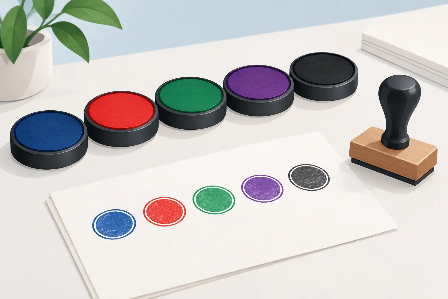
Black ink is the dependable choice for most office stamps because it is clear, professional and easy to photocopy. Blue can help distinguish an original from a copy, while red is useful for attention-grabbing messages such as “URGENT” or “OVERDUE”. Used too widely, however, red can make a document look cluttered or overly alarming. Reserve it for statuses that genuinely need attention.

The stamp size should match the job. A small date impression suits incoming post and invoices. A larger rectangular stamp is better for a return address, payment instruction or several lines of company details. If the document is customer-facing, test the position before adopting a standard process. Stamping in the same place each time makes paperwork quicker to scan and easier to file.

Where possible, make a test impression on the actual paper stock you use. Glossy, recycled, lightweight and heavily textured papers can all take ink differently. A crisp stamp on standard copier paper may look less sharp on a coated delivery note. Testing avoids surprises when the stamp becomes part of a regular process.

Build Stamps Into a Sensible Workflow

Office stamps work best when staff know what each one means and when to use it. A “PAID” mark should only be applied after the payment has been confirmed. A “RECEIVED” stamp should be placed on incoming documents as they arrive, not added later in batches when the true receipt date may be unclear.

Keep the most-used stamps close to the point of work. Reception staff may need a date received stamp beside incoming post. Accounts may need payment and approval stamps near invoice trays. A shared cupboard can seem tidy, but stamps that are hard to reach are less likely to be used consistently.

It is also worth reviewing stamps as processes change. If a business moves to digital approvals, an “APPROVED” stamp may no longer be necessary, while a stamp for scanning, filing or customer returns could become more valuable. The aim is not to stamp everything. It is to mark the moments where a visible, standard instruction improves the flow of work.

Ordering for a Team or Several Locations

If several people or sites need the same impression, ordering identical stamps avoids small differences in wording and layout. This is useful for branches, school departments, multi-site service businesses and offices where documents may be transferred between teams. Consistent marking supports consistent records.

Bulk ordering can also make sense for organisations setting up new desks or replacing worn equipment. Keep one spare for a high-use stamp, particularly a date stamp or payment status stamp. A missing stamp may seem minor, but it can interrupt a process that relies on a clear audit trail.

Handy Stamps provides practical custom options for businesses that need repeat-use marking tools without a complicated ordering process. For everyday administration, the priority is simple: select wording that matches the task, choose a durable format, and make it easy for staff to use correctly.

A good office stamp should quietly remove a repetitive job from the day. When the wording is clear, the impression is reliable and the stamp sits where the work happens, paperwork moves on with fewer delays and fewer questions.

Posted on

Stamp Ink Colours: Choosing the Right One

Stamp Ink Colours: Choosing the Right One

A stamp can carry the right wording and still fail to do its job if the impression is hard to read. The best stamp ink colours make routine marking clearer at a glance, whether you are approving invoices, marking pupils’ work, updating a service book or stamping loyalty cards. Colour is not simply a design choice. It affects visibility, meaning and how confidently people can act on the information in front of them.

For most day-to-day paperwork, black or blue remains the sensible starting point. But there are good reasons to choose red, green, purple or a more distinctive colour when the stamp has a particular purpose. The key is to match the ink to the job, the surface and the people who will rely on the impression.

Start with the purpose of the stamp

Before choosing a colour, consider what the stamp needs to communicate. A date stamp on incoming post has a different role from a teacher feedback stamp or a garage service stamp. If every mark looks alike, important information can be missed in a busy file, workbook or workshop record.

Black ink is the dependable all-round option. It gives strong contrast on white paper, scans well and suits formal office documents. It is a practical choice for address stamps, company details, signatures, reference numbers and general administration. Where documents may be copied, filed or sent to another organisation, black provides a clean and familiar result.

Blue ink is also widely used in offices and professional settings. It stands out clearly against black printed text, which can help show that a document has been checked, received or signed after printing. Many businesses choose blue for approval stamps, office processing marks and internal paperwork for this reason.

Red is useful when a stamp needs attention. It can work well for messages such as PAID, OVERDUE, URGENT, CANCELLED or ACTION REQUIRED. Used sparingly, red provides a clear visual prompt. Used for every stamp on every sheet, however, it can make paperwork look more alarming than necessary and reduce its impact.

Green often carries a more positive meaning. In schools, it is a popular choice for praise, achievement and feedback stamps. In an office, it can suit APPROVED or COMPLETED impressions. Purple offers another distinctive option where several departments, staff members or stages of a process need to be identified quickly.

Stamp ink colours for common working settings

The right choice depends on the environment. A colour that works well at a wedding table may not be appropriate for a legal file, while a bright classroom stamp may be exactly what makes feedback more noticeable to a pupil.

Offices, accounts and administration

Administrative stamps need to be legible, repeatable and suitable for filing. Black is normally best for company address stamps, document references and routine record keeping. Blue can separate processed paperwork from printed information, particularly on forms and invoices.

For finance teams, red is often reserved for exceptions and action points, such as unpaid balances or credit notes. This is useful only if the meaning is consistent across the team. Agreeing that red means one thing prevents confusion when documents pass between colleagues.

Schools and education

Teachers often use colour to make marking faster and feedback easier to spot. Green is commonly associated with positive comments, while purple, red or blue can distinguish next steps, corrections or individual teacher feedback. There is no single rule, but pupils benefit when the system stays consistent.

A praise stamp in a bright colour can feel more immediate than a handwritten note, especially for younger children. For departmental marking, different ink colours can also help show which stage has been completed without adding lengthy notes to every piece of work.

Bear in mind that not every pupil sees colour in the same way. A stamp should still use clear words or symbols rather than relying on red and green alone to convey its message. Good contrast and simple wording matter more than a colour code by itself.

Garages, workshops and service records

Service stamps need to remain clear in logbooks and on paperwork that may be kept for years. Black or blue is usually the safest choice, particularly where a stamp includes a garage name, service date, mileage field or contact details. A crisp impression looks professional and is easy for customers to read later.

If a workshop uses separate stamps for inspection, service completion and follow-up work, different colours can make the process easier to track. Keep the number of colours limited, though. A simple system is more useful than one that staff have to stop and interpret.

Retail, loyalty schemes and events

For loyalty cards, darker colours usually give the best contrast and are less likely to resemble a faint smudge after repeated handling. Black, blue and purple are reliable choices on most plain card stock. If the card has a coloured background, test the ink against it first.

At events, coloured hand stamps can assist with entry control, re-entry and age-verified areas. The colour needs to be visible in the venue lighting and distinct enough from previous days or sessions. For this type of use, durability matters just as much as appearance, particularly where skin contact, movement and handwashing are involved.

Match the ink to the surface

Paper is forgiving, but not all materials accept ink in the same way. Standard office ink is designed primarily for absorbent paper and card. It may smudge, bead up or rub away on glossy labels, coated stock, plastic, metal or fabric.

For ordinary documents, a self-inking stamp with a built-in pad offers a quick, tidy solution. The ink is held inside the stamp body, helping to deliver consistent impressions over repeated use. A traditional hand stamp and separate ink pad can be better where you need to switch colours regularly or use a specialist ink for a particular material.

Egg stamping, for example, calls for food-safe ink that is suitable for the intended application. Event hand stamps may require skin-safe formulations. These are specific jobs, so it is worth choosing a product intended for that surface rather than trying to make general-purpose office ink do something it was not made to do.

The colour of the surface matters too. Dark ink on pale paper is usually easiest to read. On kraft card, coloured paper or recycled stock, black may still work well, but blue or purple can occasionally lose contrast. A test impression on the actual material is the quickest way to avoid ordering a colour that looks good in theory but disappears in practice.

Think about copies, scans and long-term records

A vivid colour can look excellent on the original document but become less clear when copied or scanned in greyscale. If paperwork may be sent digitally, printed by another department or retained as evidence, choose an ink that remains legible without colour.

This does not mean every operational stamp must be black. It means the wording, size and contrast need to do their share of the work. A clear PAID stamp in red can still be understood in a black-and-white scan if the lettering is bold and well spaced.

Avoid pale inks for information that must be retained. Light pink, yellow or pastel shades can be attractive for personal projects and occasion stationery, but they are not always suitable for forms, records or high-volume workflows. For wedding favours, christening details or personalised gift packaging, the visual effect may matter more. For business records, readability normally comes first.

Keep your colour system simple

Where more than one person uses stamps, write down what each colour means. A short instruction beside the stationery cupboard can prevent red being used for both paid invoices and urgent problems, or green being used for both completed work and items awaiting review.

It also helps to store replacement pads and refill ink with the relevant stamp. Using the wrong refill can affect the quality of the impression and, in some cases, the operation of the stamp. Re-ink before impressions become faint rather than pressing harder, as excessive pressure can create blurred edges and uneven marks.

For custom stamps, the clearest choice is usually the one that lets people understand the message immediately. Handy Stamps can help businesses, schools and organisers choose practical stamp formats and ink options for regular use.

A well-chosen colour saves a second look. Make the mark clear, keep its meaning consistent, and test it on the material you use every day before placing a larger order.

Posted on

Stamp Garage Service Books Clearly and Quickly

Stamp Garage Service Books Clearly and Quickly

A service book is a small document with a big job. When you stamp garage service books at the point of work, you give customers a clear record of what has been completed and help your workshop present a more organised, professional service. A crisp impression is quicker than handwriting the same garage details on every visit, and it makes the book easier for a future owner, dealer or technician to read.

The right stamp should support your existing paperwork rather than add another step. For most independent garages, mobile mechanics and vehicle servicing businesses, that means a reliable stamp carrying the business details customers need, with enough space left in the book for the date, mileage and technician information.

Why stamp garage service books?

A properly completed service book provides continuity. It shows where a vehicle has been maintained, when the work was carried out and, depending on the information recorded, the mileage and type of service. While a stamp alone does not prove every item of work undertaken, it gives each entry a consistent, identifiable source.

This matters when a customer sells or trades in a vehicle. A tidy service history can be easier to assess than a collection of loose invoices, particularly where servicing has been carried out by the same garage over several years. It also helps your own team: if a customer returns with their book, the garage name, contact number and address are immediately visible.

There is a practical customer-service benefit too. Handwritten business details can be rushed, incomplete or difficult to decipher. A stamp gives every customer the same clear information without asking reception staff or technicians to write it repeatedly. Over a busy week, those few saved seconds add up.

What should a garage service stamp include?

The best layout is usually the simplest one. Start with your trading name, then include the contact details a customer is most likely to use. For many garages, this is a telephone number and postcode or town. A full address can be useful where the service-book box has room, especially if customers may need to identify a branch years later.

A typical garage service stamp can include your business name, address, telephone number, email address and website. If you operate from more than one site, make sure the wording identifies the correct branch. Avoid cramming in every possible contact method simply because it is available. Small text may fit on a stamp design, but it is no help if it is hard to read after repeated impressions.

If you are VAT registered and routinely need the number on customer paperwork, consider whether it belongs on this stamp or on invoices only. In a compact service-book space, the garage identity and a usable contact number will normally be more valuable. The same applies to promotional wording. “Vehicle servicing and repairs” may be helpful, but only if it does not make the essential details too small.

Leave room for the service record

Your stamp should not cover printed fields in the book. Before ordering, look at several of the service books you use. Some have a generous blank panel, while others provide a narrow box designed for a dealer-style mark. Measure the usable area rather than the entire page.

A rectangular layout generally suits service books because it follows the shape of the available space and allows contact details to sit in neat lines. A small square stamp can work for compact books or where you only need a trading name and telephone number. The correct size depends on the books in front of you, not on the largest design you can fit on a page.

Choosing between self-inking and traditional stamps

For a garage counter or workshop office, a self-inking stamp is often the most convenient option. The ink pad is built in, so staff can make repeated impressions without handling a separate pad. It is tidy, quick and well suited to routine servicing paperwork.

A traditional hand stamp with a separate ink pad can be a sensible choice where you need more control over ink colour, use occasional specialist inks or prefer a larger stamp impression. It may also suit lower-volume use. The trade-off is that it takes a little more care: the pad must be inked correctly and stored so it does not dry out or transfer ink where it should not.

For most standard service-book entries, black or blue ink gives the clearest professional result. Blue can make the stamped information easier to distinguish from black printed text, while black is familiar and highly legible. Whichever colour you choose, use it consistently across your records where possible.

A date stamp can also be useful, but it does not always replace a service stamp. A dated entry tells the customer when work took place; it does not identify the garage. Some workshops use both, adding the business stamp first and the date alongside it. Others keep the date handwritten because the service-book layout already has a dedicated field. Choose the approach that is quickest for your team to complete accurately.

How to make every impression readable

Even a well-made stamp needs the right technique. Place the service book on a firm, level surface and make sure the page is fully supported underneath. Press down evenly, without rocking the stamp from side to side, then lift it straight up. This helps prevent blurred edges and uneven ink coverage.

Allow the impression a moment to dry before closing the book or placing another sheet on top. This is particularly worthwhile with glossy paper, coated pages or heavier ink coverage. A quick check before handing the book back can prevent a customer leaving with a smudged record.

Keep the stamp clean and protected between uses. Dust, oil and workshop residue can affect the detail of the impression, so it is best kept at reception, in the office or in a clean drawer rather than beside the ramp. If the stamp starts to look faint, use the correct replacement ink for its stamp type rather than over-inking it with a random product. Too much ink can cause text to fill in and lose definition.

Build the stamp into your service process

The most reliable system is one that has a clear owner. Decide whether the technician, service adviser or receptionist stamps the book, and make it part of the normal handover check. If everyone assumes someone else has done it, service books are easily missed during a busy collection period.

A straightforward process might be: confirm the work is complete, enter the date and mileage, stamp the relevant page, have the appropriate person sign if required, then check the book before returning the keys. The stamp should support the record, not substitute for the details that the manufacturer, customer or your own procedures require.

It is worth matching the wording on the stamp to the name used on invoices and other customer documents. Consistency reduces confusion, particularly if your trading name differs from your limited company name. If your phone number, premises or branding changes, replace the stamp promptly. Continuing to use old contact details can create avoidable frustration for customers trying to trace a service history.

When a bespoke layout is the better choice

Off-the-shelf wording may be enough for a simple garage name stamp, but a bespoke layout is normally better for a service-book stamp. It allows you to choose the exact wording, line spacing and size for your own paperwork. This is especially useful for specialist workshops, MOT and repair centres, independent dealers and mobile mechanics that need to fit limited contact details into a small area.

Before approving a design, read it at the size it will be stamped. Check abbreviations carefully, including postcodes and telephone numbers. Ask whether a customer who has never visited your garage could understand who completed the work and how to contact you. If the answer is yes, the layout is doing its job.

Handy Stamps can produce custom garage service stamps designed around the details you use every day, helping workshops keep repeat paperwork clear without unnecessary complication.

A service-book entry may take only a moment to complete, but it stays with the vehicle long after the appointment. Keep the wording clear, the impression sharp and the process consistent, and each stamp becomes a useful part of the service you provide.

Posted on

Choosing a Legal Document Stamp for Your Office

Choosing a Legal Document Stamp for Your Office

A contract arrives without a clear receipt date. A signed form is passed between departments with no indication of who checked it. An invoice is filed before approval. These are small gaps, but they can make everyday administration slower and harder to trace. A legal document stamp gives paperwork a consistent, visible record of what happened to it and when.

For solicitors’ offices, conveyancers, accountants, HR teams and busy business administrators, the right wording can reduce handwritten repetition and make document handling clearer at a glance. The key is choosing a stamp that supports your process without suggesting a legal status it does not provide.

What a legal document stamp can and cannot do

A stamp is useful for recording an administrative action. It may show that a document was received, copied, reviewed, paid, scanned, filed or sent. It can also include a date, a case reference, a department name or an area for initials.

However, a stamp does not automatically make a document legally binding, notarised, certified or formally executed. In the UK, the validity of an agreement, deed or certified copy depends on the relevant legal requirements, the wording used and, in some cases, the identity and authority of the person signing or certifying it. A rubber stamp should support an established procedure, not replace it.

This distinction matters most when ordering wording such as “Certified True Copy”, “Executed as a Deed” or “Authorised Signatory”. These phrases may be appropriate where your organisation has a defined process and the correct authority. If there is any doubt, check the wording with your compliance lead, solicitor or governing policy before putting it into regular use.

Common legal document stamp wording

The most useful stamps tend to deal with routine document control. They make a clear impression every time, which is easier to read than hurried handwriting and helps staff follow the same process.

Receiving and recording documents

A “Received” stamp with a date line is a practical choice for post, forms, correspondence and supporting evidence. Many offices add fields for the recipient’s initials, matter number or department. This creates a simple starting point for tracking where paperwork entered the business.

A “Date Received” stamp is particularly helpful when deadlines, response periods or retention dates need to be calculated from the day a document arrives. If the office handles a high volume of paperwork, a self-inking date stamp can save considerable time over a manually written date.

Review, approval and filing

“Reviewed”, “Approved”, “Checked” and “Filed” stamps help move documents through a controlled process. The wording should match the action being recorded. For example, “Checked” may be suitable for confirming that all pages are present, while “Approved” should only be used where approval is genuinely required and authorised.

A stamp with tick boxes can work well where staff need to record several routine checks, such as ID seen, documents copied, fee paid or client notified. Keep the layout simple enough to be completed quickly. A crowded stamp often leads to incomplete impressions or fields that no one uses.

Copies, disclosure and internal handling

“Copy”, “Duplicate”, “For Information Only” and “Confidential” are useful for preventing misunderstanding when documents are shared internally or sent to third parties. A clear confidentiality mark can be particularly valuable in HR, legal, financial and safeguarding files, where papers may pass through several hands.

For document packs, “Original Seen”, “Copy Held” or “Scanned to File” can provide a practical audit trail. They do not determine a document’s legal standing, but they help demonstrate how it has been handled within the office.

Accounts and payment records

“Paid”, “Accounts Approved”, “Invoice Checked” and “Payment Authorised” stamps remain useful even where accounting is largely digital. Paper invoices, expense claims and supporting receipts still need to be identified quickly before filing or scanning.

Where payment controls involve more than one person, include separate spaces for initials and dates rather than a broad approval statement. That gives the accounts team a clearer record of who completed each part of the process.

Choosing the right stamp format

The best format depends on how often the stamp will be used, how much text it needs to hold and where it will be stored. A small office that stamps occasional correspondence has different needs from a conveyancing department processing files all day.

A self-inking stamp is usually the most efficient option for repeated use. The ink pad is built into the unit, so the stamp is ready to use and the impression is consistent from one document to the next. It is a good fit for “Received”, “Paid”, “Confidential” and other high-frequency wording.

A traditional hand stamp is a sensible option for larger bespoke designs or lower-volume work. It requires a separate ink pad, but it gives flexibility over ink colours and is often suitable for larger text areas. If you need to mark a sizeable box with several fields, this may be the better choice.

Date stamps deserve separate consideration. A standard date stamp lets the user change the date manually, while a custom stamp can include permanent wording around it, such as “Date Received” or “Entered On”. This combination keeps records consistent without requiring a new stamp every year.

Getting the wording and layout right

Start with the exact action you want the stamp to record. “Received” is clearer than “Office Use”, and “ID Copy Taken” is more useful than a vague “Completed”. Direct wording helps new staff use the stamp correctly and makes files easier for colleagues to review later.

Include only information that will be completed every time. A stamp with five blank fields may look thorough, but it is not helpful if only one field is regularly filled in. In practice, a date, initials and a short reference line are often enough.

Think about the documents being marked, too. A stamp that is too large can obscure text on a standard letter or form. For most administration, a compact rectangular stamp gives enough room for wording and a date without taking over the page. Larger formats are better suited to file covers, internal checklists and document control sheets.

Use a readable typeface and leave adequate space between lines. Fine text may look neat in a proof but can become difficult to read on textured paper, copied pages or documents that have already been scanned. Clear, practical layouts usually perform best.

Ink colour, confidentiality and record keeping

Black and blue are generally the most practical ink colours for professional records. They reproduce reliably on photocopies and scans, and they are easy to read against standard paperwork. Red can be useful for urgent internal actions, but reserve it for a purpose staff understand, such as “Overdue” or “Action Required”.

Avoid using a stamp as the only evidence of a sensitive decision. For matters involving identity checks, authorisation, legal advice or regulated procedures, the relevant file should still contain the supporting information required by your policy. A stamp can indicate that a step was completed, but it cannot explain the evidence considered.

Confidential documents also need sensible control of the stamp itself. Keep wording such as “Confidential”, client references or internal approval marks where authorised staff can access them. This is especially relevant in shared reception areas, schools, healthcare settings and multi-tenant offices.

When a bespoke stamp is worth ordering

Off-the-shelf wording works well for common actions, but a bespoke legal document stamp can save more time when your office repeatedly records the same details. Adding your firm name, department, case prefix or standard file fields makes the mark more useful and reduces the chance of staff writing different versions of the same information.

It is worth checking the final proof carefully before ordering. Look for correct spelling, sufficient room for handwriting and wording that reflects the current process. A small change at this stage is far easier than replacing a stamp after it has been issued across the team.

For larger teams, consider ordering a few identical stamps for the people who use them most. Sharing one stamp between several desks creates unnecessary delays, and a spare provides continuity if one unit runs out of ink or is temporarily misplaced. Handy Stamps can produce custom wording for these everyday office controls, with options suited to both occasional and high-volume use.

A well-chosen stamp will not replace careful legal procedure, but it can make the routine around that procedure cleaner, quicker and easier to follow. Choose wording your team can apply with confidence, and let every impression earn its place in the file.